
University Redesign Recap
Redesigning a large, high-traffic website for an organization is a task that often gets put off until the technological debt is deeper than anyone cares to admit, and the effort to bring a redesign to fruition is often invisible. Thousands of man-hours are expended to balance an incredible number of priorities while repairing deep-reaching problems few were even aware existed. Yet at the end of it all, the user merely sees a page with some text and pictures. Hardly noteworthy. Yet occasionally it must be done, and for the past half year, it’s what my team has done with mst.edu.
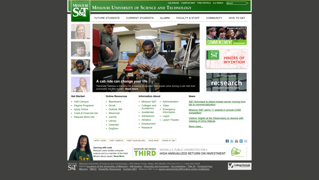
Pre-redesign
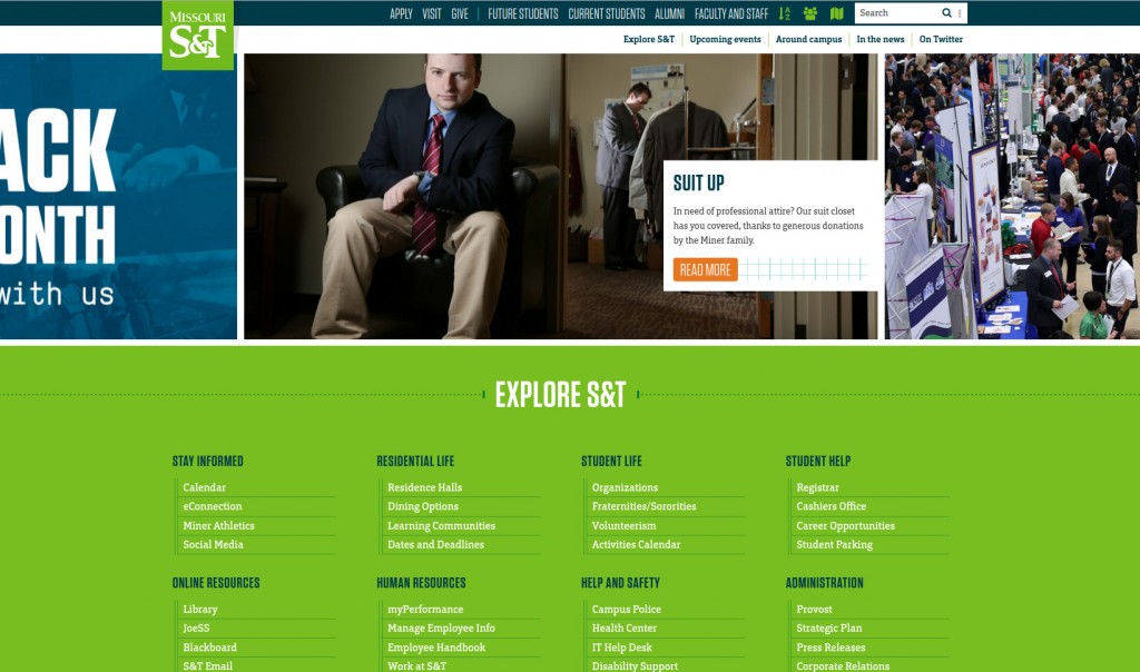
Post-redesign
During the process I had a great time reading accounts of other developers faced with similarly ambitious jobs with strange surprises, and felt that as the process comes to a successful close, it would be interesting to recall it.
The scope and the resources
Since learning HTML back when CPUs commonly went into slots, I’ve worked on a fair few redesigns; however, nothing I handled had quite the glacial scale of a university web presence. The site we were to redesign consisted of over 17,000 pages spread across 400 subdomains in multiple templates, curated by an army of over 300 content authors with basic training in the TERMINALFOUR Site Manager CMS. Not the biggest redesign ever, but still pretty big.
The issue was further compounded by the nature of the CMS. Rather than outputting its data based on a theme (like WordPress), the site was divided into “layouts” and “content types.” Each layout consisted of a page header and footer, and each content type was a series of fields that content authors could fill out, which were then passed through the type’s HTML and output between the header and footer.
A serious problem immediately presents itself: Templates must be compatible with all content types that may appear within them. It almost seems like a truism at first until you really start considering the implications of that separation. You can make any fancy, modern layout you want, but unless you intend to break every other page on the site or require the content authors to completely redo years of work in new content types, you can’t significantly change the output. The content types are not aware of the template they’re appearing in (i.e. their structure must be the same from template to template), and as I discussed in a previous post, the types were originally written to tie directly into the layout and were not modular (each started with a </div> and then failed to close itself). The jank was compounded by the fact that these non-modular content types were intended to appear as columns, and leveraged the page layout’s structure to do so, meaning there wasn’t a straightforward path to switching into a grid system. While not exactly nightmare mode, it wasn’t going to be a cakewalk, either.
The constraints on the project were simple:
- New template on all pages
- Mobile-friendly everywhere
- Visuals must match new branding guidelines
- All existing content (that wasn’t already broken) had to work
- Content authors could not be required to change or update anything
- 6 months
You could be forgiven for thinking that an undertaking like this would be pricey. A proposal for a single subdomain redesign at Stanford can reach $25,000. Central Michigan University’s 2011 redesign clocked in at $550,000. Ours went a different path, though, using only the in-house talent already assigned to maintaining the front-end web presence: One programmer, one designer, one writer, and one manager. Total expenditure above normal operation: Zero.
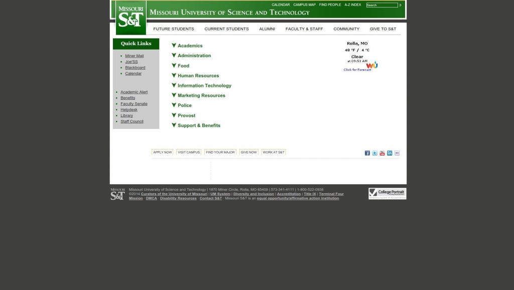
Pre-redesign
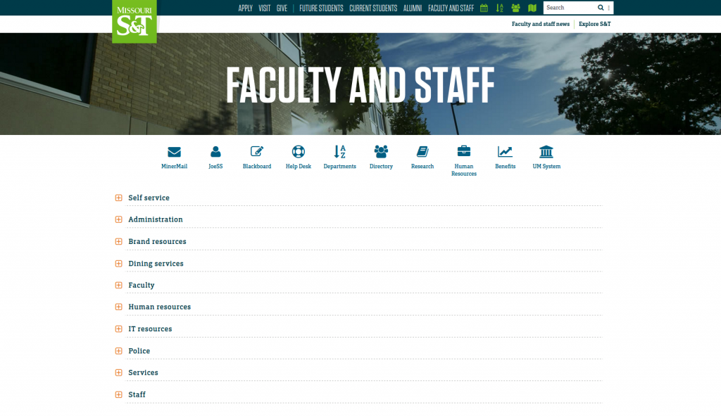
Post-redesign
A new dialect to express the inexpressable
The immediate issue to handle was the seeming impossibility of rolling out a controlled transition if making changes to the content types meant breaking all existing sites. What we needed was a way for the CMS to detect which page layout it was outputting into and then choose one of several possible content type outputs. TERMINALFOUR’s standard publish processor has no logic, though, aside from a very basic method of verifying whether there’s content in a field before outputting a string of HTML. What we turned to could best be described as a promising new feature in its infancy: The T4 JavaScript layout processor. As of the time of this writing, it’s very sparsely documented, and what features we found were mostly by trial and error, but we eventually came to the conclusion that certain parts of it were stable enough to use as a foundation.
That just left the syntax. As I covered in another post about the T4 JavaScript layout processor, it was not something we felt we could use. The sheer amount of space it took to pull in fields and perform checks on content made the types written in it very difficult to understand and extremely unfriendly to potential future maintainers. We needed a way to keep the content types simple and semantic, and doubly so since each content type would now technically contain multiple types in a conditional.
To solve this, I wrote a language superset that reframed commonly-used features of the javascript layout processor into a simple, chainable jQuery-like syntax. After running it by the TERMINALFOUR engineers and receiving their blessing that it posed no foreseeable future problems, we began quietly putting it to use.
The hazards and necessity of rewriting literally everything
When I started working at the university, times were simple and I was just another of those 300+ authors. There were two content types: Body Content and Sidebar. They were WYSIWYG HTML and absolutely, irredeemably awful. The lack of any design guidance meant that the whole presence was a table-based free-for-all of outdated tag attributes, mismatched font sizes, crazy colors, and designs that could make the old MySpace blush. By the time we were ready for this redesign, we had overhauled about 90% of the presence into a basic, painfully backwards-compatible responsive* template that provided tighter branding control and close to 30 content types to ensure there was always a better option than going crazy with table borders.
Trouble was, in order to make those content types render out clean HTML for a modern template, we’d need them in the JavaScript processor first before we could even begin writing the new outputs. While converting these wasn’t exactly difficult work, it was slow going. When there are thousands of variations of sometimes inexplicably-formed content that need to be handled by only a couple of blocks of code, the potential for missing something is high, and getting something wrong would instantly result in an unmanageable number of support calls for a team as small as ours.
Somehow we managed to pull this off with only a couple of tiny glitches that were repaired before word got out and tickets got in. Now several months into the process, the foundation had been quietly slipped into place.
First contact with the visual redesign
In the meantime, our designer had been working himself into the ground to capture the new brand identity into a single template that would work for all pages and facilitate navigation around the historically fractured and siloed presence. We knew it would be controversial from the outset. The university had changed its name eight years before, and even still there were occasional tremors of discontent regarding it. The new guidelines had been honed for the better part of a year from market research, internal surveys, focus groups, and observation by an outside agency, and we all recognized their potential, but we also knew our campus: They’d cling hard to an identity.
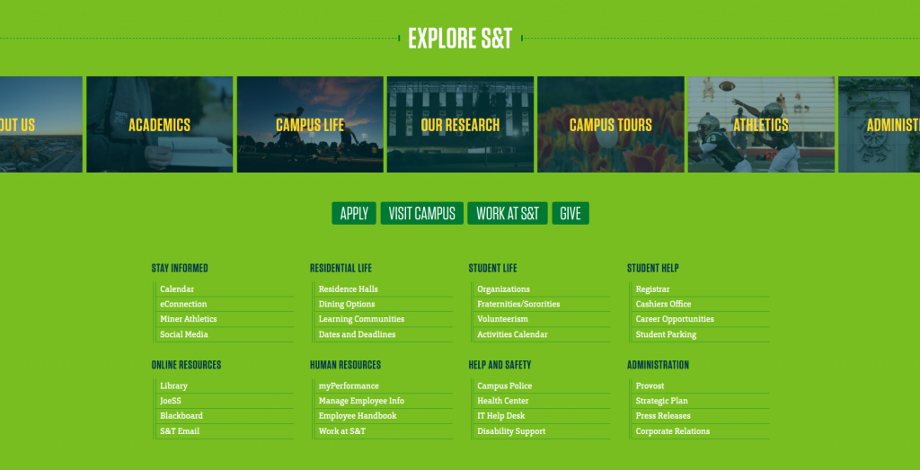
Perhaps the most ambitious piece of the new template was the wholly revised navigation, dubbed “Explore S&T,” which would come to reside both on the main page and the bottom of every other page across the presence. This persistent navigation meant that the huge number of balkanized and unrelated subdomains would finally carry a uniform method to navigate between them. The concept married a short list of the most commonly-used links with a gallery of categories such as “Academics,” “Athletics,” and “Our Research,” which led the user to comprehensive, well-designed pages that could in turn lead them to the subdomain containing the information they needed. The choice to use these supporting pages as opposed to menus or mega menus was a simple one: The university is easily categorized, and each part serves a purpose a visitor may need, but there are simply too many departments, offices, programs, etc. to ever fit logically in any single-page menu.
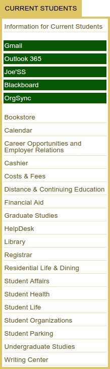 The inclusion of this navigation led to one of the biggest surprises in the project. Reception of Explore S&T on department pages was highly positive. People seemed to get it, and even appreciate it–not even one complaint about something I expected would make the more siloed departments foam at the mouth; however, the exact same navigation on the main page was met with a shocking amount of initial resistance. Prior to Explore S&T, navigation there was handled by a series of tall and highly politicized drop-down menus, one of which contained so many links that it hung off the bottom of the page on some laptops, rendering the lower links inaccessible. These drop-downs could be hovered open with some difficulty on mobile devices, but were more or less useless if you weren’t on a desktop. Clicking the buttons for the menus instead of hovering over them led to anemic supporting pages peppered with broken links from years past. In one particularly hilarious case, four links in the same drop-down menu took users to the exact same page.
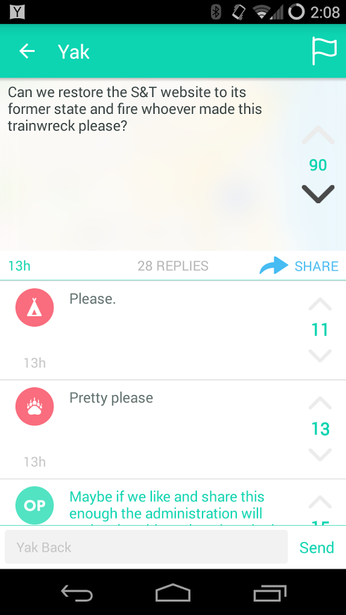
If you followed Yik Yak in the week after the transition, though, you could be forgiven for believing that we had smashed the crown jewel of UI and were now laughing maniacally all the way to the bank–but only on that one page; the rest were cool.
Prepare yourself
Someone in IT really liked it.
Looking back, I can see a few lessons I wish I had already learned before starting a project with such a widespread visual impact:
- Grow a thick skin; you’ll need it for a couple of days.
Perhaps the most memorable takeaway from this redesign was that existing users really, really hate change, even in cases where no change occurred. We received multiple complaints from users who could no longer find certain links, even though the links in question had not been moved or changed at all. Even a few weeks into the transition, there was a small but steady chorus of staff and students clamoring for us to bring back the twelve-year-old, pre-iPhone 1, IE6-compatible structure (responsiveness, browser support, and functioning menus be damned), going so far as labeling the new site a “trainwreck” and calling for us to be fired. No amount of positive analytics, records from focus groups, or demonstration of improved user flow could do much to change this sentiment. Ultimately what changes it is time. After an initial outpouring of criticism from a vocal few, radio silence ensues surprisingly quickly. - People can only dislike what they can see.
It was to address this very same outpouring of criticism that eBay famously reverted its background color from white back to yellow, and then made the yellow a shade lighter each day until it was white again–of course, few even noticed it had happened the second time around. I wish we could have made the changes in a similar manner; however, considering the constraints it went surprisingly well. In the future, I’d like to do more iterative design and break out of the common 3-5 year cycle that can be so damaging to a brand. - Navigation is a sacred cow, but only on the front page.
In a charged piece of real estate like a university gateway, practically every unit on a campus feels that they should be prominently placed while seemingly ignoring that if they got their wish, it would fracture the experience for the vast majority of visitors who did not, in fact, come there specifically to learn about a particular [faculty/staff/student/alumni/donor/research/corporate partner] committee. For a week or two, you’ll be bombarded with these requests, but they fall off very quickly as new habits form. The key is to have a defined set of target user groups that everyone (administration, faculty, staff, students–everyone) agrees upon before starting. The requests to bias the navigation toward a particular favored group will come from all directions post-launch, but if this agreement is already in place, they’ll all be canceled out post-launch as well. - You’re not up against the outgoing design.
You are in fact up against an impossibly idealized version of the old design that only exists in the minds of users. Upon seeing something new, a truly disturbing percentage of returning users will simply forget all of their experiences coping with the past issues. This isn’t entirely surprising–you just spent months studying and correcting those flaws; they saw them once, adopted a new behavior, and forgot about them. It’s helpful not to get your hopes up about anyone throwing any parades because you repaired an egregious and embarrassing defect; it was wiped from the collective memory the very instant you pushed the new code. - Green is not a creative color.

I use my hair to express myself.
Getting stable again
Once the initial period during which it’s cool to nitpick the new design and wax poetic about the days of old dies down, you’re left with a trickle of feedback regarding the actual, objective use of the site. Assuming the product is good, this is an extremely pleasant stage. The bugs are practically nonexistent, there’s ample time to locate and patch any that do remain, and the old learned behaviors kick in and suddenly navigation is no longer a war zone. The abrupt lack of any feedback is actually quite disconcerting and led us to actively solicit for it on some of our most visited pages using a single, anonymous text box. As of this writing nobody has submitted anything. Frankly I’m still not sure exactly what to make of that, because it definitely works. Either we did a fine job or instilled one serious case of learned helplessness…